What makes a website GREAT in 2022?
10 April 2022 · 5 min read

Chelcie Plowright
Managing Director & Brand Strategist
What makes a website GREAT in 2022?
10 April 2022 · 5 min read
Are you starting a new website or thinking about a redesign? Then it helps to be aware of current trends or ways that you can super charge your website before you begin design and construction. What makes a good website constantly changes as technology improves. Does that mean you need to reinvent your website every year? Not exactly. Fundamental principles such as clutter-free UX design and fast loading times will always be part of the game plan.
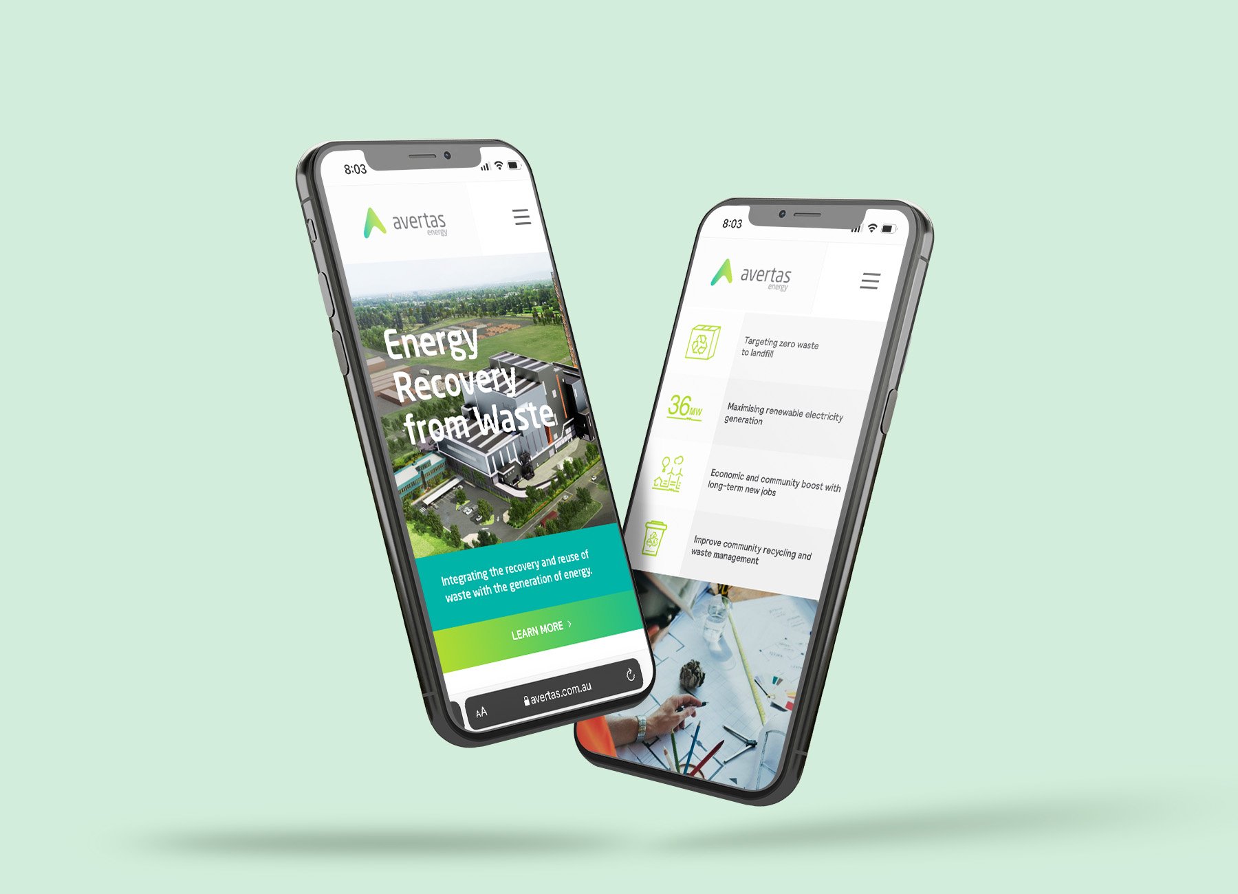
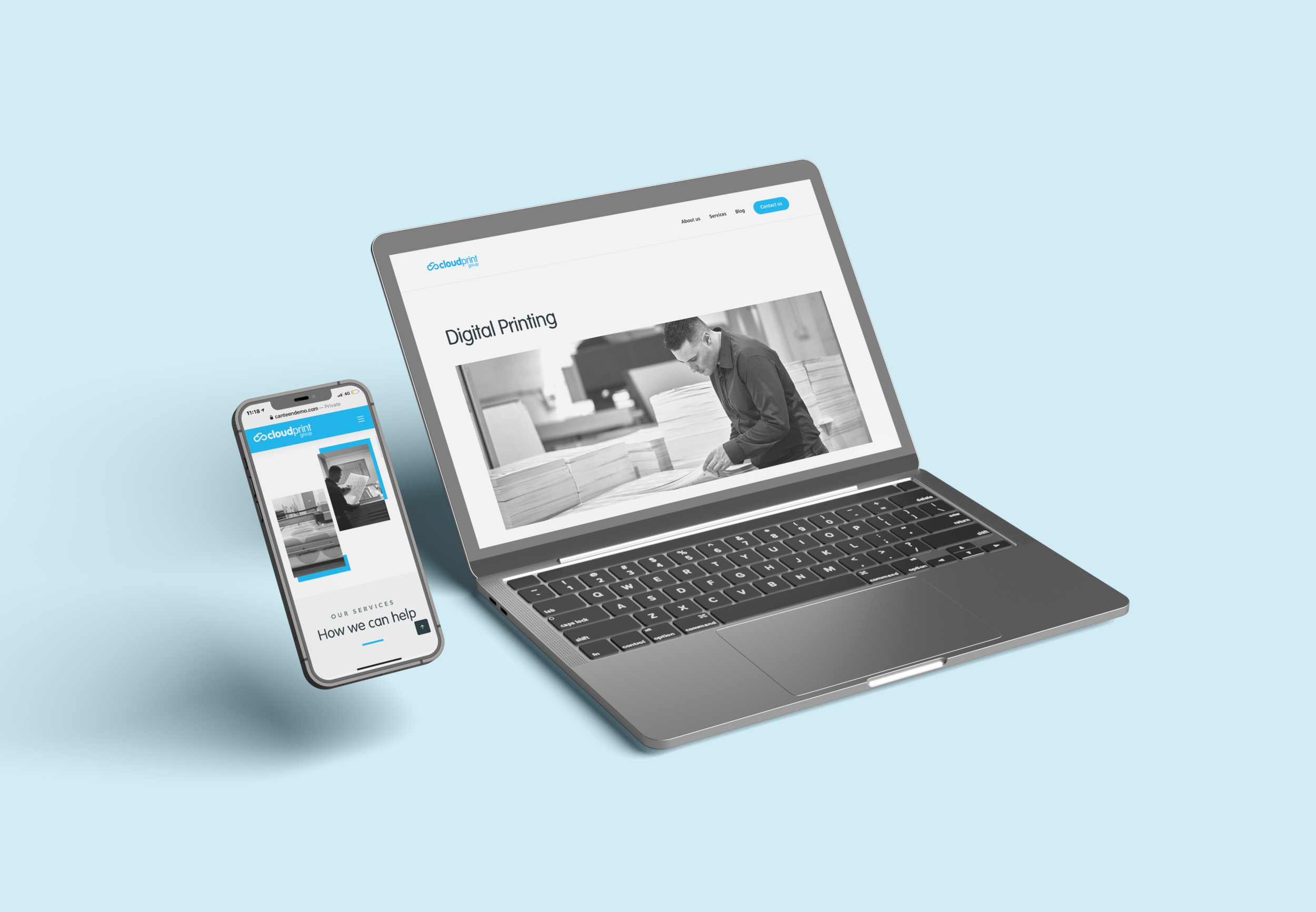
For instance; 73% of web designers believe that a non-responsive design is a top reason why visitors leave a website. Therefore, companies that ignore mobile optimisation are not giving their business every edge to win new customers. Mobile design is here to stay, and if you still have a website which operates poorly on mobile, it’s time to speak to your web development team (or Creative Resort!)
In summary; we recommend looking into:
- Website loading speeds
- Clutter free design
- Bright, bold colours
- Personalized and targeted content
- Progressive lead nurturing forms
Read onwards to learn what you should keep top-of-mind to ensure that your website raises eyebrows in the best way possible in 2022.

Lightning-fast website and mobile loading speeds
It is estimated that every second your website loading speed is delayed, the conversion rate decreases by 7%. If this doesn’t have you scrambling to figure out how long your current website takes to load, then you do not understand the severity of the issue. Nowadays, users expect instant loading times – especially as internet speeds and device processing power have improved.
How do you increase your website loading speed so it can compete in 2022? These are mostly multiple technical details your webmaster can take care of. However, in a nutshell, it’s about reducing the size of page elements and cleaning up the coding.
Unsure of who to speak to about your website? Contact us today for a complementary speed audit today! Our friendly tech team will happily review your site speed and offer some suggestions.
Furthermore, consider other aspects of your website design when thinking about speed. How long does it take to fill out a menu? Could you reduce the number of fields yet achieve the same objectives? Reducing the time it takes for visitors to execute actions improves usability and overall satisfaction. Consider using metrics such as time taken on page and asking for customer feedback to make the process of using your website faster.
Ensure your website design has a clear purpose.
Your website should have a clear purpose that is evident from the first few seconds. Sure, you are selling a product or service – but what one specifically? If you have a subscription that converts the best, then push that throughout your website. Being super clear on what you are offering or selling prevents customers from getting confused or overwhelmed by choice.
Think about what information customers need before they can make a buying decision. Typically it is:
· The price or OFFER.
· The product or service BENEFITS.
· The UNIQUE SELLING PROPOSITION (Why it’s better than your competition).
This information should be prominently displayed to the potential buyers to help them along the purchasing journey.
Therefore, every webpage element that does not work towards the objectives described above is a distraction. They should be removed or worked into the website so that it doesn’t detract from primary goals. For example, if you want to share information about your products in the form of articles, then create a blog subdomain for your website.

Bold brand colours will be in fashion in 2022
Many companies have gone down the minimalist route during the last decade and have chosen plain white backgrounds with bland colours. This allows website designs not to alienate or clutter a user-interface.
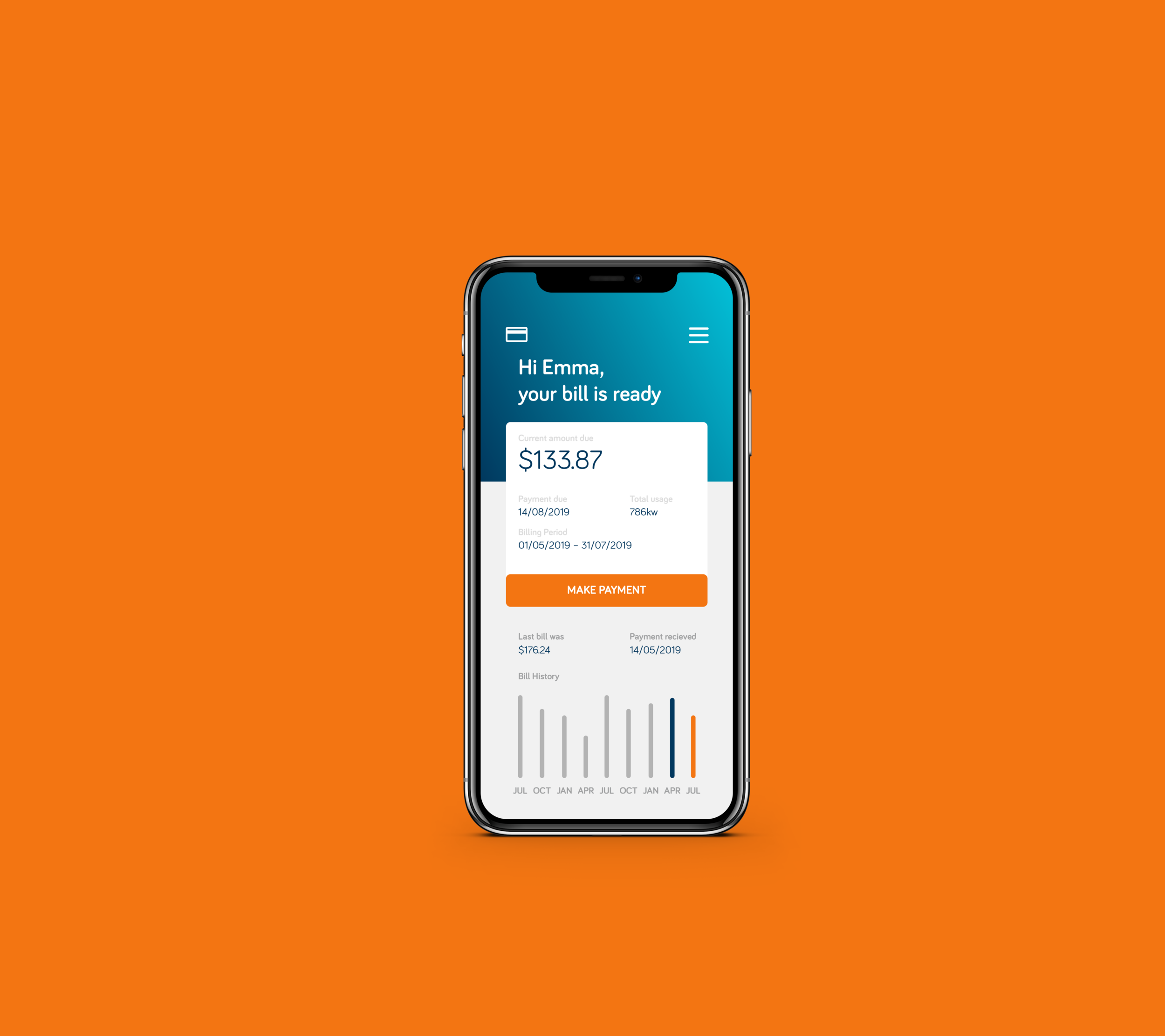
However, websites that want to stand out in the modern internet landscape and take advantage of the situation by adding a bold colour scheme. Bright colours in all the right places will make a brand pop – it will be memorable, which is what matters when customers are at the buying stage.
Personalisation in your offers, products and services
Whether you like it or not, the depth of tracking and data harvesting is becoming more severe. Companies have access to more tools and methods to find out who is visiting their website and what products they are likely to buy. Relevant marketing offers are a benefit of personalised targeting that 70% of consumers want for their shopping experience.
When done correctly, customers will appreciate offers that are specific to their needs. The trick is to be upfront about what tracking technologies you are using. If they are not intrusive and come from a genuine place of customer satisfaction, then you shouldn’t get in hot water.
Dynamic lead nurturing forms
Want to super-charge your website marketing in 2022? Then link your CRM tool with lead nurturing that establishes a relationship with your potential buyer and helps to nurture them down the sales funnel. Dynamic forms (forms which are triggered based on user behaviour; for example: abandon cart) can capture the mood of the lead to increase the conversion rate. Make sure to display the forms in easy-to-spot locations and don’t add too many fields.
Final thoughts
To summarise, you can create a kick-ass website in 2022 by creating a responsive design, reducing the loading speed, crystalising the website design to a specific purpose, considering bold colours, and using personalised targeting with dynamic lead capture forms.
These ideas are just the tip of the iceberg. Keep an eye out for more ideas that could allow your website to become a trendsetter in the niche you are trying to capture new customers for business growth. And if you’re looking to have a conversation with someone about revamping your website in 2022, don’t hesitate to contact us today!
About the author
Connect with Chelcie PlowrightNewsletter
Sign up for latest news & updates