NIODA
Unfurling Potential: A Fresh Identity
We partnered with NIODA to refresh their brand identity, creating a visual language that reflects their mission of uncovering deeper dynamics within organisations and individuals.
At A Glance
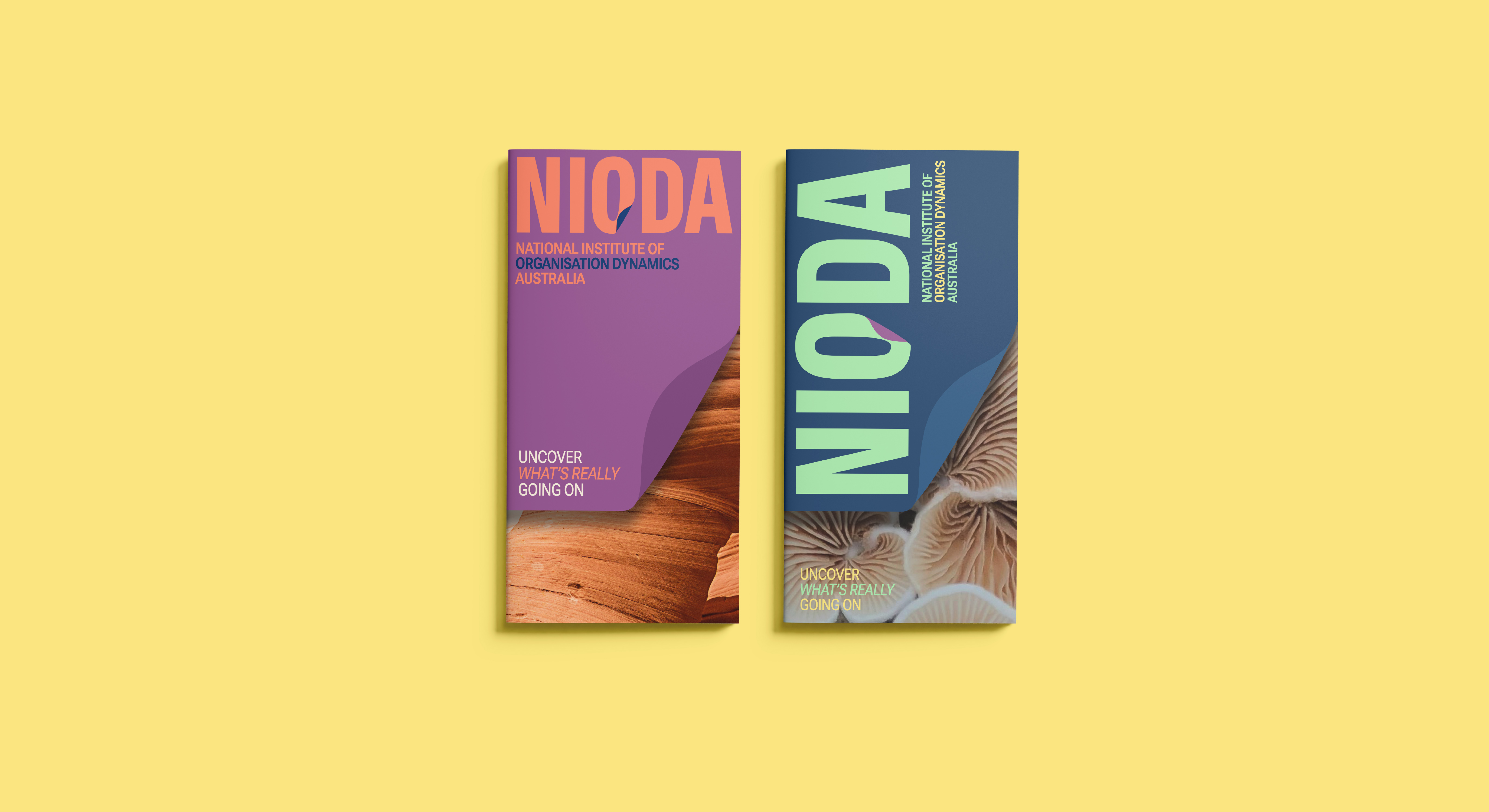
The new logo centres around an "O" with a subtle peeling effect, symbolising the Institute’s new tagline “Uncover what’s really going on”—a visual cue for peeling back layers to reveal insight and growth. The broader identity draws on the concept of organic growth, paying tribute to NIODA’s focus on leadership coaching, personal development, and transformative workshops.

Logo & Colour Palette
A bright yet earthy colour palette balances vibrancy with groundedness, embodying both the dynamism of change and the stability of NIODA’s expertise. The corporate identity is cohesive, dynamic, and adaptable, ensuring NIODA can communicate with clarity and impact across digital and print.
From Nature to Narrative
The brand identity was grounded in the idea of organic growth—a reflection of NIODA’s role in supporting individuals and organisations as they uncover potential and evolve. We drew inspiration from the natural world, where growth is a process of unfolding and unfurling. Just as mushrooms push through soil or flowers gradually open to reveal their full form, NIODA’s work helps people and teams surface new insights, develop resilience, and step into their potential.
This natural metaphor became the foundation for the visual language: dynamic shapes, layered textures, and a palette that feels both bright and earthy. It captures the duality of growth—grounded and stable, yet alive and transformative.
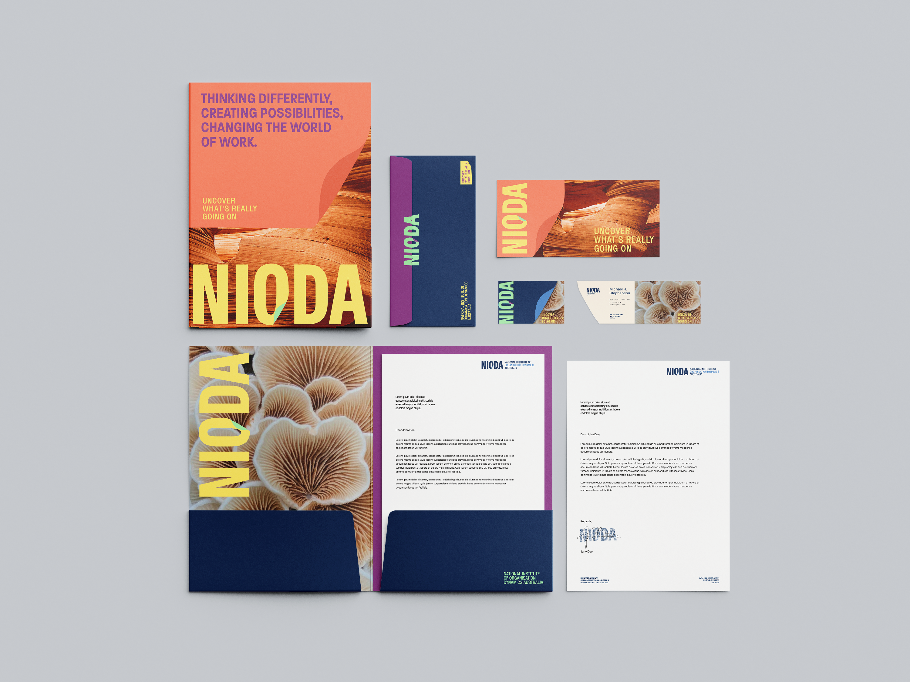
Cohesive Marketing Collateral
The refreshed identity was brought to life across a suite of marketing materials designed to support NIODA’s programs, workshops, and events. Consistency was key: the new logo, colour palette, and organic graphic elements were applied seamlessly across brochures, presentation templates, stationery, and digital assets.
Each piece was crafted to feel professional yet approachable—reflecting NIODA’s academic credibility while remaining engaging and dynamic. The use of earthy yet bright tones, combined with the unfolding motif, creates a distinctive and cohesive presence that reinforces the brand’s message: uncovering what’s really going on to enable growth and transformation.

Come test the waters
Request a proposal
Send a message