
Nicotine To Go
Helping People Quit — Faster.
At Creative Resort, we love working with brands that make a difference — and NicotineToGo is doing just that.
This value-driven online retailer is helping people around the world quit smoking, offering nicotine replacement products that are affordable, accessible, and delivered fast. But more than just a retailer, NicotineToGo is a trusted partner on the journey to better health.
We recently completed a full rebrand for NicotineToGo, including new messaging that puts their customers — and their goals — at the heart of the story.
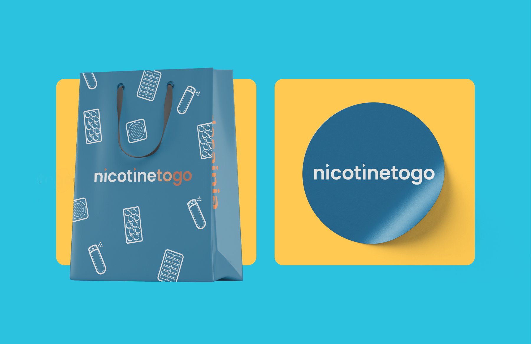
A Clear Mission, Sharpened
NicotineToGo wanted to stand apart in a category that can often feel transactional or overwhelming. So we helped them define what makes them different:
Trust is their North Star.
Support is part of every order.
Speed is a promise — not just in shipping, but in helping people move toward a smoke-free life, faster.
Messaging That Meets People Where They Are
For people trying to quit, the journey is personal. It’s not always linear. And it’s not just about buying products — it’s about feeling supported along the way.
We helped shape NicotineToGo’s voice to be empathetic, encouraging, and grounded in the real challenges (and victories) of quitting smoking. Whether you’re in the U.S., Australia, or anywhere around the world, the message is the same: You don’t have to do this alone.
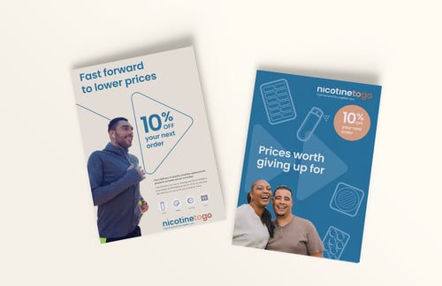
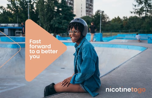

Fast Forward, Visually
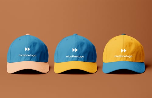
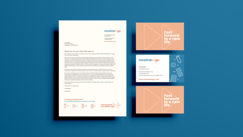
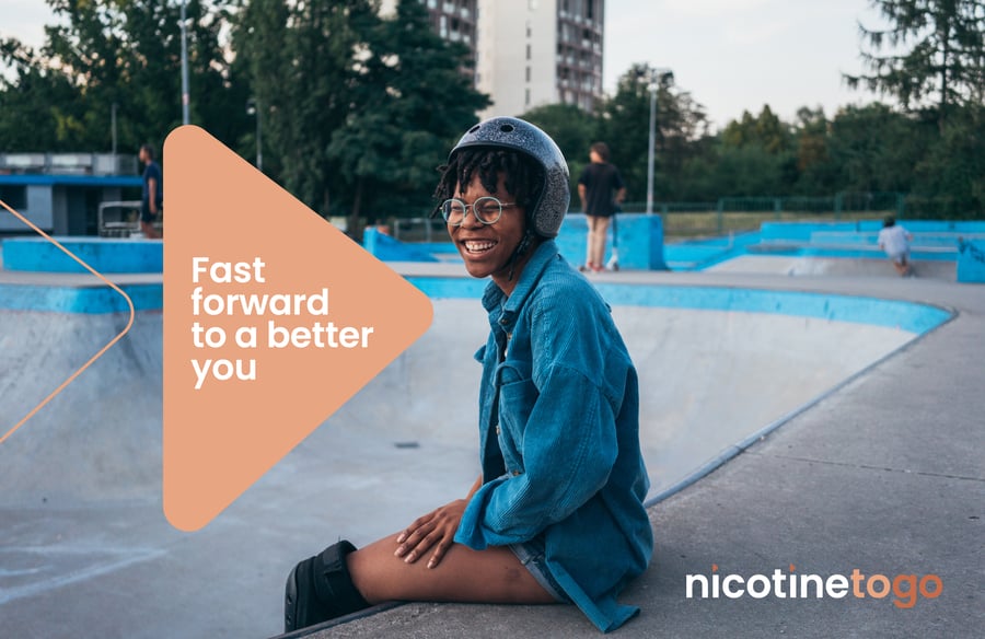
To bring the “Fast forward to a better you” brand promise to life, we designed a bold new visual identity. At the heart of the brand is a double arrow motif — a clean, modern symbol of momentum, progress, and possibility. It visually reinforces the idea that quitting smoking isn’t about looking back — it’s about moving ahead, quickly and confidently.
We also introduced a vibrant color palette: bright, youthful, and energetic tones that echo the renewed vitality and sense of freedom people feel when they break free from smoking. It’s a look that feels fresh, hopeful, and full of life — just like the people NicotineToGo supports every day.
Bringing it together online
A huge shoutout to the talented team at Croissant & Baguette, who took our brand identity and messaging work and translated it into a digital experience that’s every bit as modern, fresh, and user-friendly as we imagined.
From clean navigation and clear calls to action, to intuitive product discovery and mobile-first design — the new NicotineToGo website makes it easier than ever for customers to get the support they need, fast. We couldn’t have asked for a better creative partner to bring this next chapter of the brand to life online.

Come test the waters
Request a proposal
Send a message